EverlyHealth //
Design Principles
Our why
We believe strong design principles create stronger teams. They give designers a shared language, reduce friction in decision-making, and keep the user at the center of every product conversation.
To build that foundation at Everlywell, I organized and facilitated a two-day workshop with Product Design and Research focused on defining the principles that would guide how we design, collaborate, and grow.
We began by studying inspiring examples from brands and products we admired, identifying the qualities that resonated most. From there, we grounded the work in real user insights, partnering with Research to uncover the needs, frustrations, and expectations shaping our experiences today.
The Process
-

Collect Input
Pull inspiration, user insights, and team perspectives
-

Identify Patterns
Affinity-map ideas to uncover recurring themes
-

Define Meaning
Translate themes into shared definitions and intent.
-

Craft Principles
Craft principles into clear, actionable design guidelines
Through collaborative exercises like keywording, affinity mapping, and mind mapping, the team uncovered recurring themes that reflected both our organizational values and the emotional experience we wanted users to feel. Together, we transformed those ideas into a clear set of actionable principles that could guide product decisions across teams.
The Result
-
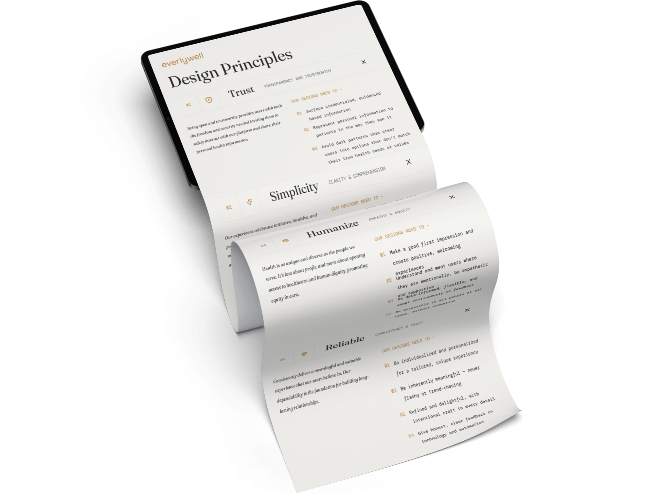
Being open and trustworthy provides users with both the freedom and security needed inviting them to safely interact with our platform and share their personal health information
Our designs need to-
Surface credentialed, evidence-based information
Represent personal information to patients the way they see it
Avoid dark patterns that steer users into options that don't match their true health needs or values
-
Our experience celebrates initiative, intuitive, and practical interaction, ignoring cognitive load on users. Clarity manages the state of comprehension and confidence, allowing for quick decision-making.
Our designs need to-Lead with the most meaningful subjects and terminology to be easily understood
Limit distractions. Present only a few options at a time
Provide progressive disclosure: high-level overview with the ability to deep-dive
Maintain unified, predictable, and learnable patterns throughout
-
Guardrails, not gates. Helping our users by offering assistance when needed, striking the right balance of support and autonomy.
Our designs need to-
Provide an overview and outline every step of the experience
Teach users about their health in context
Surface and indicate which actions to perform first
Be one step ahead, anticipating what users need next
-
Health is as unique and diverse as the people we serve. It's less about profit, and more about opening access to healthcare and human dignity, promoting equity in care.
Our designs need to-
Make a good first impression and create positive, welcoming experiences
Understand and meet users where they are emotionally, be empathetic and supportive
Be data-informed, flexible, and adapt continuously to feedback
Be accessible to all people at all times, without exception
-
Consistently deliver a meaningful and valuable experience that our users believe in. Our dependability is the foundation for building long-lasting relationships.
Our designs need to-
Be individualized and personalized for a tailored, unique experience
Be inherently meaningful, never flashy or trend-chasing
Refined and delightful, with intentional craft in every detail
Give honest, clear feedback on technology and automation
The outcome was more than a framework for design. It became a shared vision for how we work together and build experiences with intention. The workshop created alignment, strengthened collaboration, and gave the team a lasting tool for evaluating tradeoffs, prioritizing user needs, and making more thoughtful decisions at scale.